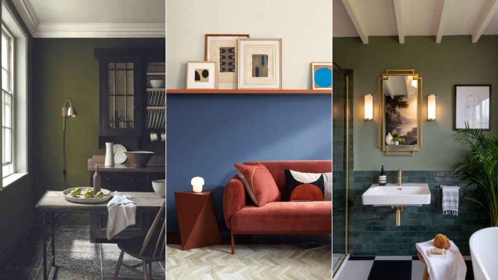
Located between green and blue on the color spectrum, teal is a popular and versatile hue for decorating. Reminiscent of seascapes and peacock feathers, this vibrant jewel hue is perfect used on an entire wall to create a dramatic, luxurious interior, or pair it as an accent piece with a neutral or more muted color scheme.
While teal has always been popular, we’re seeing a shift towards earthy greens and blues as people look for warmer, more inviting spaces with a more subdued feel. To find alternatives to teal, we asked color experts for their insights on trending blue and green hues.
What color would replace teal?
Teal is a popular, versatile color that never goes out of style. A vibrant and uplifting shade, decorating in teal is perfect for a striking dining room or a noteworthy powder room, but over the past few years, experts have noticed a shift towards more muted, subdued hues. Soft earth greens such as sage, dusty olive and lichen tones are thought to be growing in popularity, following the general tonal trend of warm and muted hues. And if you’re color-savvy and looking for an impactful interior, deep midnight blues, olives and forest greens are excellent alternatives to teal.
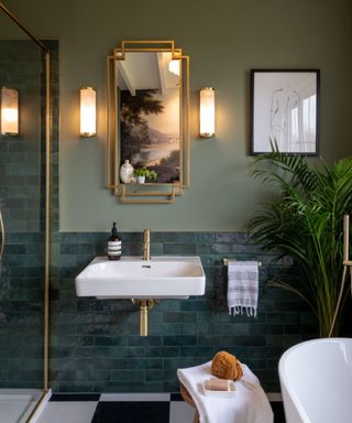
(Images by Lick Green 02, Tomas photography)
“Earth green shades are becoming increasingly popular as a calming alternative to teal. They pair well with natural materials to create an easygoing, serene atmosphere,” says Tash Bradley, director of interior design and color psychology at Rick. “Green 02 is a soft sage green with gray undertones that promotes peace and meditation. Like teal, Green 02 pairs beautifully with our romantic Pink 07, which has a complementary cocooning quality.”
“Blue 06 is another great alternative to teal, especially for those who love the depth of teal but want a more classic look,” adds Tash Bradley. “Navy blue has a timeless feel to it that works well in both older and more modern homes.”

As interior design director and colour psychologist at home décor brand Lick, Tash Bradley uses her expertise in colour psychology and theory to help people all over the world find the colours that positively impact their spaces, lifestyles and health.
1. Choose a warm blue
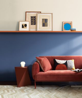
(Image courtesy of Benjamin Moore)
Decorating with blue has always been a timeless choice, and it shows no signs of slowing down as we move towards 2025. Benjamin Moore recommended its Blue Nova shade, a blend of blue and purple, as its color of the year for 2024. It’s a warmer alternative to greenish-blue tones.
“Associated with attributes such as trust and responsibility, blue is one of the most universally loved colors and is quickly overtaking teal for the top spot. A staple in interiors, blue’s connection to the natural world instantly creates a calming, harmonious atmosphere,” said Helen Shaw, international marketing director, Benjamin Moore.
“Choosing a warm neutral like Blue Nova 825 creates an instant feeling of comfort and security and will complement any room in the home. In south-facing spaces, blue balances the intensity of sunlight, while north-facing rooms create a warm, inviting feel, especially when combined with natural materials and rich terracotta accessories.”
2. Calm your space with sage green
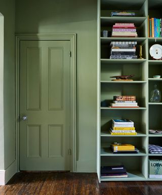
(Image courtesy of Farrow & Ball Lichen)
Sage green may be all the rage right now, but it’s always been popular as a way to incorporate the soothing tones of nature. It’s synonymous with the tranquil and nourishing qualities of the natural world, so it’s no wonder we’re increasingly decorating with green as we seek spaces that help us relax and escape our busy lives.
“Sage green is a versatile neutral green that can easily create a relaxing bedroom atmosphere or a timeless living room,” explains Patrick O’Donnell, brand ambassador at Farrow & Ball. “Depending on the light, the grey shades can read and create a naturally modern feel. Like all greens, sage green creates a calm, relaxing environment, making this color also perfect for a home office where you can focus on the task at hand.”
3. Decorate with bold botanical greenery
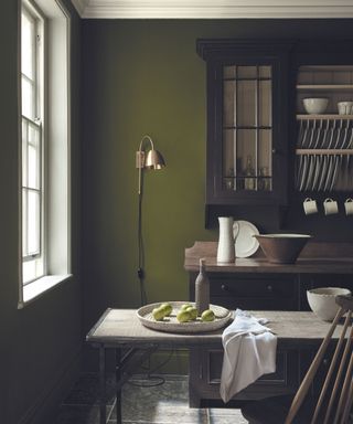
(Image courtesy of Little Green Jewel Beetle)
“Nature-inspired botanical greens, particularly deeper tones, continue to grow in popularity as we seek to strengthen our connection with the natural world,” explains Ruth Mottershead, creative director at Little Green.
“It’s been interesting to see how customers have embraced colour and pattern over the last few years, with many realising the importance of spending time in nature and how changing up their home environment can uplift their mood and have a positive impact on their mood,” says Ruth Mottershead, creative director at Little Green.
“The sense of well-being we get from spending time in nature has led to a desire to recreate this sense of connection and positivity in our homes, driving a new-found love for green in all its shades.”
While the muted sage green has been a staple of the Little Green Collection for many years, stronger tones are coming to the forefront, including the vibrant Jewel Beetle (pictured above) and the bold Puck.
Nourishing, fresh, plant greenery is perfect for breathing life and energy into everyday spaces like the kitchen. Check out our Green Kitchens feature for more inspiration.

Ruth Mottershead, Creative and Marketing Director for Little Green and the Paint & Paper Library, has worked for the family business since 2011. Her role includes conceptualising the paint and wallpaper collections, overseeing marketing materials and coordinating photo shoots. Passionate about the transformative power of colour, she also speaks and presents within the industry to end users, interior designers, architects, journalists and Little Green staff.
4. Introduce new “dirty” vegetables
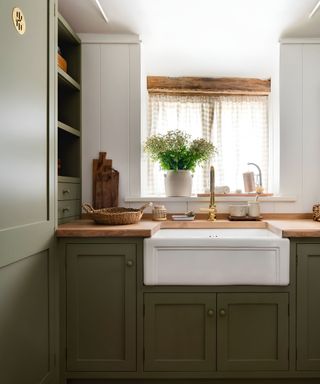
(Image credit: Jojo’s Green COAT x House Nine Photo by Robin Quarelle)
Earthy brownish greens are growing in popularity and are a nice alternative to teal and blue-green shades. Rob Abrahams, CEO and co-founder of paint brand COAT, explains why the company has noticed a trend towards “dirty greens” in recent years.
“COAT has only been on the market for a little over three years and we’ve seen a shift in popularity from fresh greens to dirtier greens – meaning greens with yellow and brown undertones. Blue undertones tend to be the fresher greens,” says Rob Abrahams.
“The first colors to see this change were white and neutrals, as people moved from cooler colors to warmer, earthy colors. Greens have followed the same path. Muted greens, whether dark or light, feel more like neutrals in that they don’t stand out too much and blend comfortably into the background.”
COAT recently partnered with interior design studio House Nine to launch an all-new Green Collection, the second installment of the collaboration that includes three lush, nature-inspired shades, including the versatile JoJo Green, pictured above.
5. Pair a dramatic teal with a deep blue
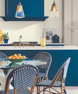
(Image courtesy of Sherwin-Williams)
If you love the deep teal color but want to avoid teal shades, try a muted midnight or ink blue, which are becoming increasingly popular among homeowners, according to Emily Kuntz, color marketing manager at Sherwin-Williams. Or, if you prefer something warmer, try a deep berry hue.
‘“Deep midnight blues like Salty Dog and dark olive tones like Garden Gate are replacing teal as consumers continue to seek comfort, stability and a connection to nature,” explains Emily Kuntz. “Deeper tones continue to gain momentum due to their connection to quiet luxury and a sense of timelessness. These dark, rejuvenating tones exude confident sophistication and can provide a dramatic backdrop to any space.”
“Another dark tone to watch is carnelian – a deep plum-berry that, when applied generously, can create the sort of serene, cocoon-like space that many people aspire to achieve in their homes.”
As we’ve seen in this article, teal will always be beloved for its alluring vibrancy, but earthier, more muted greens and blues are becoming popular alternatives for those seeking a calm, cocooned feel. Just as general color trends are shifting toward browns and earthy umber-based hues, the blues and greens we use in decor are also becoming warmer and more “dirty.”
For those who love jewel tones and decorating with bold, intense hues to create a luxurious, eye-catching look, deep midnight and indigo tones, dark olive and forest green are great alternatives to teal.

